Agricura
Orti bio & Giardini
Overview
Agricura is an app which allow potential users to keep in touch with their gardener, thanks to the possibility to chat with him, to book an appointment and to discover tips and news every day about bio products and pruning styles.
Challenge
A gardener needed to start a new business in Sicily (IT), offering consultancy on the cultivation of bio products and pruning services.
Solution
A modern logo describing the values he wants to show to the users. Moreover, an innovative app to allow people to enter into a relationship with the gardener, giving them also the opportunity to book an appointment.
Role
Role: UX Designer
Timeline: 6 months
Team: Simone Tomarchio, Katherine Fragalà
Tool
Figma
Approach
Users interviews
Competitive and comparative analysis
Usability tests
Results
Agricura's logo incorporates the client values, so that potential customers may immediately understand them. Another result obtained by the design process is the Agricura's app, which allows the client to enforce the relationship with the clients, also giving them the opportunity to book an appointment.
User research
In order to get some information about how the people see the gardeners, I conduct several interviews, with five open-ended questions and follow up questions. This method allowed me to understand deeply how people feel when they interact with gardeners, and what are the quality they should have. Moreover I discovered the user pain points that obstacle a fully positive experience.
User research:
Pain points
Honesty
Users are reluctant about gardeners because they declare much more hours that have to be paid than those they actually worked.
Costs
Gardeners are expensive and sometimes they don’t have the right skills for a certain kind of works.
Flexibility
Gardeners don’t easily adapt to the customer needs
Respect for nature
Gardeners tend to use product that are unhealthy for people and nature.
User Persona: Ilary

User journey Map

User Persona:
Maria

User journey Map

Starting the design
I started designing the logo with the help of an artist and a graphic designer, asking the gardener which were his values and which of them he wanted to show through the logo.
Moreover I started making some paper wireframes fo the app.
Branding design
I asked the gardener which were the values and the skills he wanted to comunicate to the people. Moreover, during the interviews I asked people which were, in their opinion, the skills a gardener must have. The most common were:
-
Passionate about his job
-
Honest
-
Updated on the last trends about bio agriculture
-
Thrustworty
-
Caring
For these reasons I Designed a logo which has a hand with a growing plant, that means "care" and the skills in agriculture; the Etna volcano, to visually represents the origins of the gardener; the branding name, "Agricura" encloses everything I described. I added the payoff "Orti Bio e Giardini" to inform potential users that the gardener has also skills in bio agriculture.


Digital Wireframes
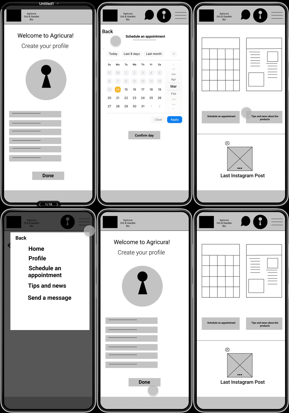
I tried to design an app as simple as possible, with the basic information. The home has been divided in two section: the upper-one contains the possible choices the two group of user personas can make; the lower-one has the latest instagram post of the gardener’s profile page.
Low fidelity
prototype

Usability study: findings
-
Part of users feel confused because they don’t know the day-slots and the hour-slots available.
-
Most users can’t register by social media.
-
A part of users try to click the icons “calendar” and “tips and news” instead of clicking the buttons.
-
There’s not any button to edit the changes on the profile.
I conducted an online unmoderated usability study with five people: 3 females and 2 males from 28 to 55 years. I asked them to record a video or an audio of their experience, and the main findings are:

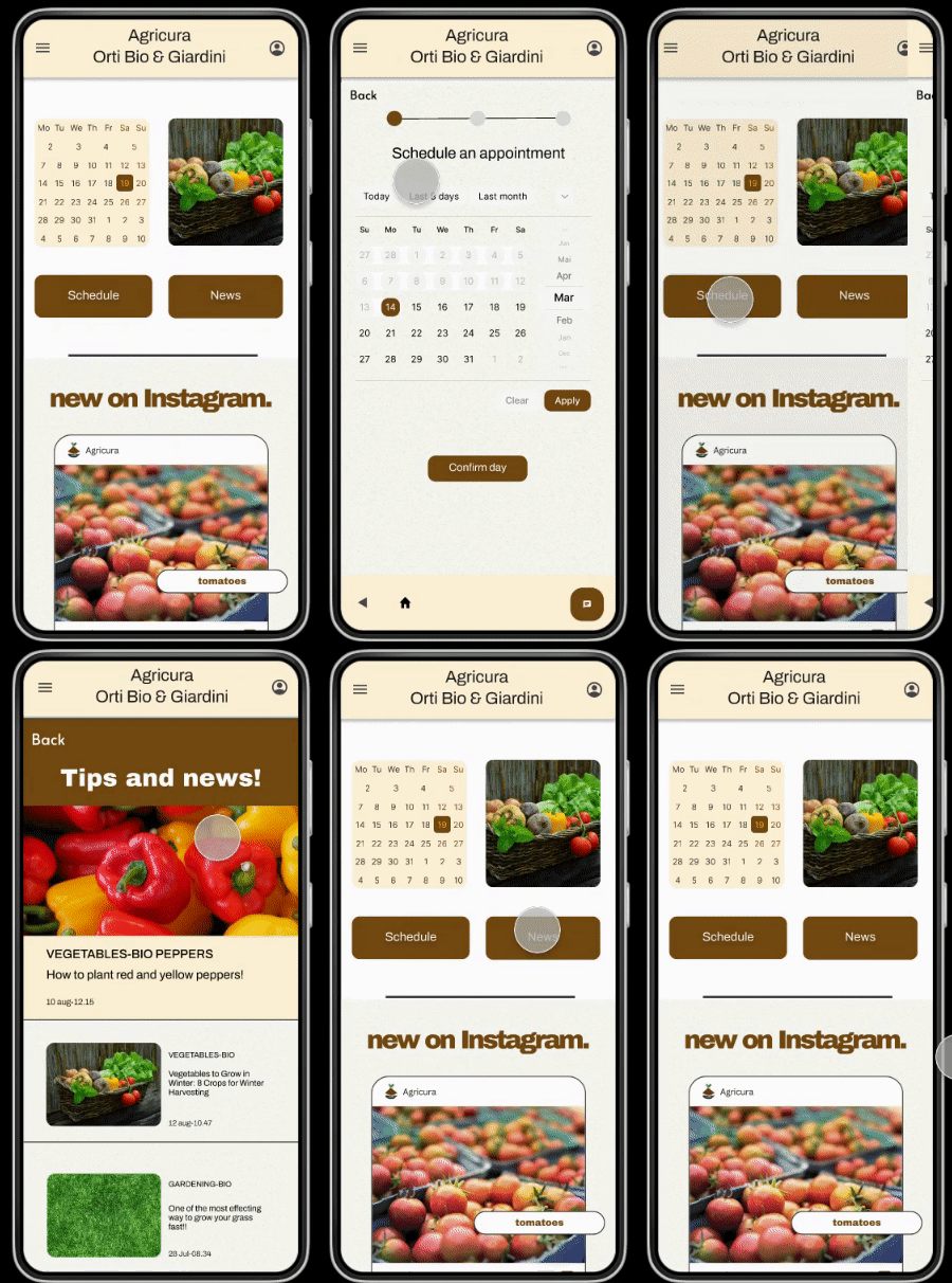
High-fidelity Prototype
Accessibility considerations

The colors have been changed to satisfy the color contrast checker requirements

More than one access have been included so to allow users to complete a task

The design is linear and there’s no much text to not create confusion.
Takeways
Impact
The Agricura’s app is a way to make a strong connection between the gardener and the users. The news section and the chat allow people to interact, giving also them the opportunity to know many tips related to bio products and pruning methods.
What I learned
It’s not so easy to show to the users the values of the gardener. Moreover, In the design process is important to deeply listen to the needs of the users. Many things I took for granted they weren’t for the people who were interacting with the interface.
Next Steps
It’s necessary to conduct more usability studies and user researches to verify if all the pain points have been solved or not.
The app needs more animations, such as loading and progress indicator.
Thank you for visiting my portfolio!
Let's connect
Feel free to give me your feedback or to contact me to get in touch.
Email: tomarchiosimone@gmail.com